Grid
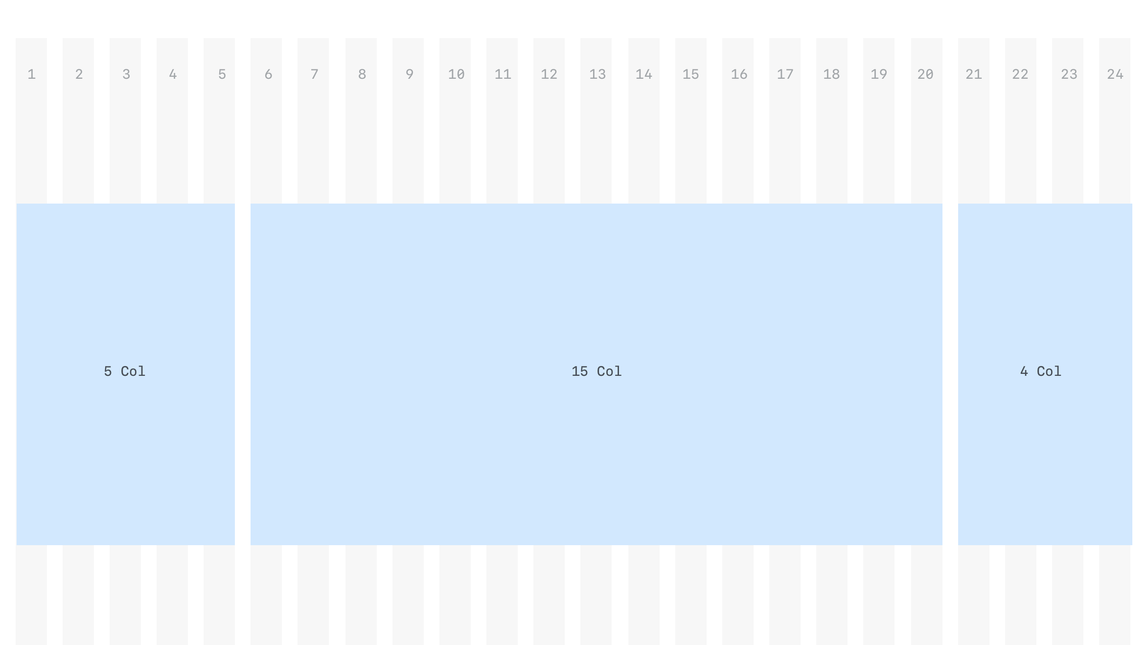
The grid system helps maintain a horizontal rhythm to the page. All major layout-ing elements should line up to the columns
Grid container
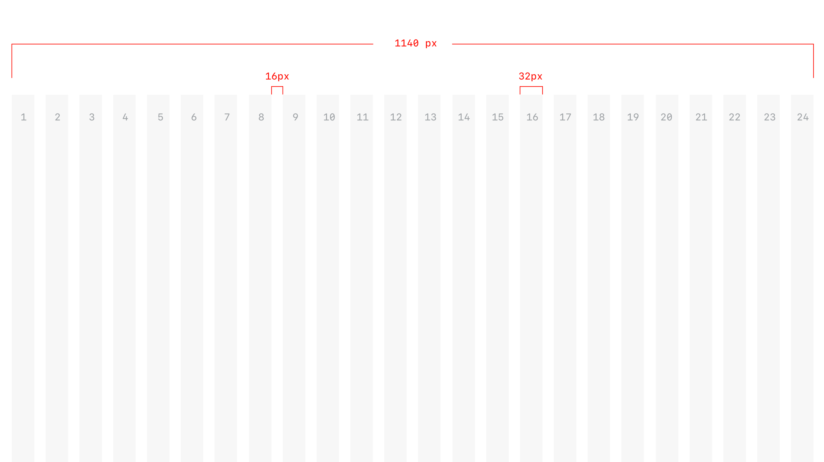
The container constrains the grid system to a max width of 1140px. On smaller screen sizes the container shrinks to take up the available space on screens. More on this later.
Grid sizes
The grid composes 24 columns of 32px each with gutters of 16px. All borders and paddings are included within the widths, since border-box is applied on the grid.
Mixed grids
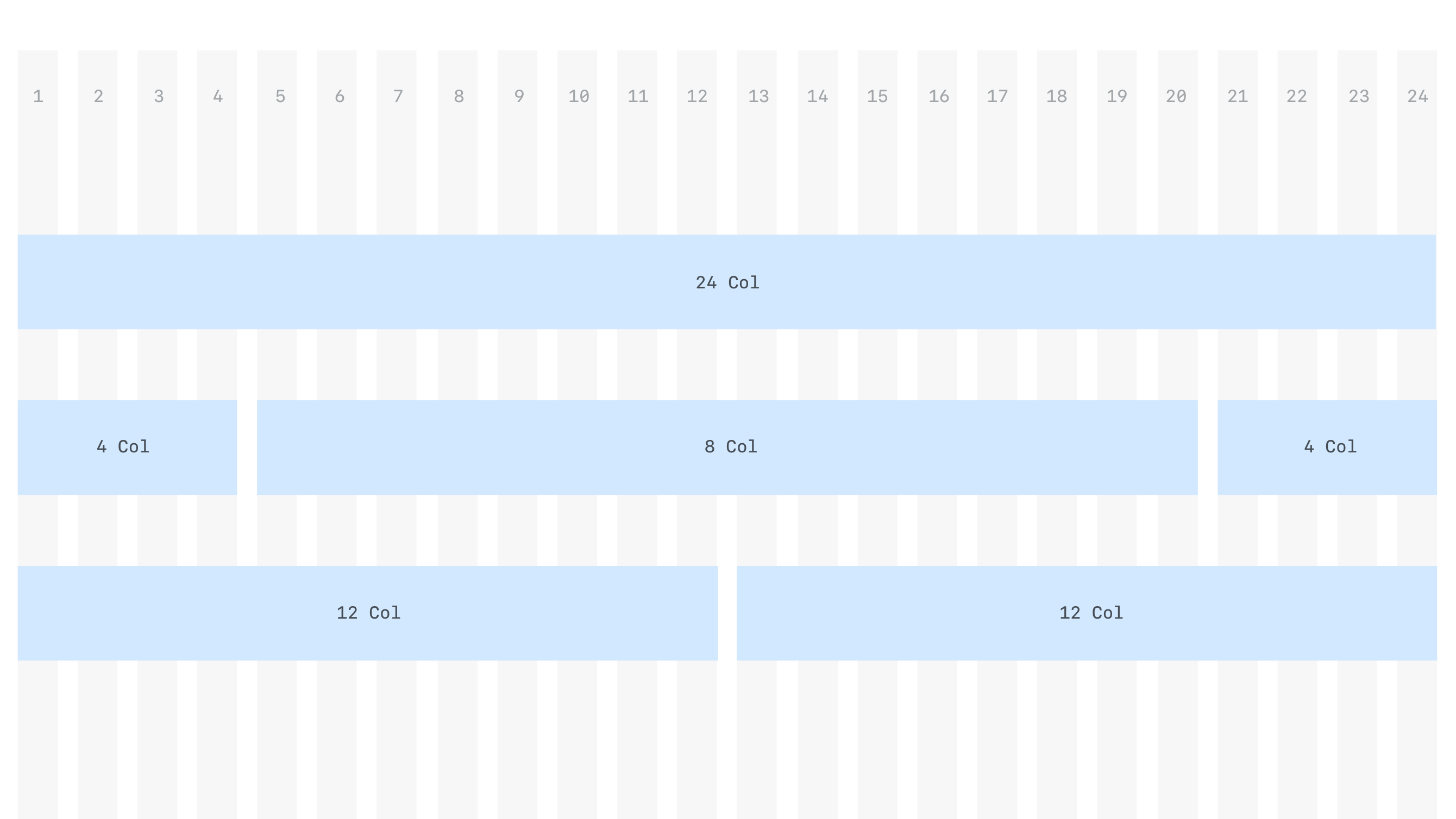
The grid layout can be easily extended by mixing different column sizes. It is also possible to nests columns within a single column.
Offset
Its possible to leave a few columns "blank". Its not necessary to use all available columns when considering a layout.
You chose to leave a gap of a few columns between elements.
Example layouts
In the example below is a multi column layout centered on the page,while leaving a gap of 2 col on either side.
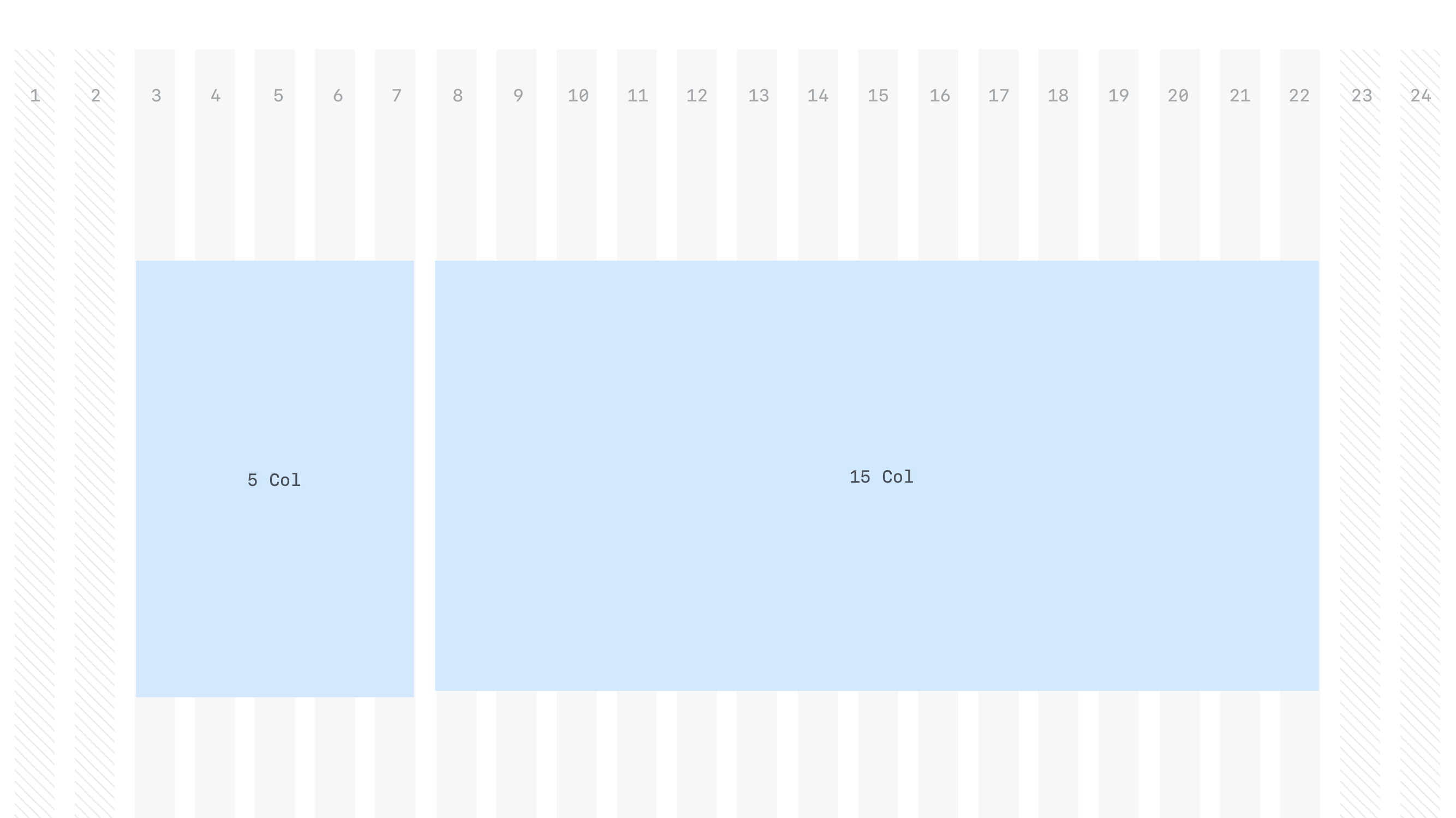
This layout is an example of a 3 col layout with each section taking up different numer of columns.